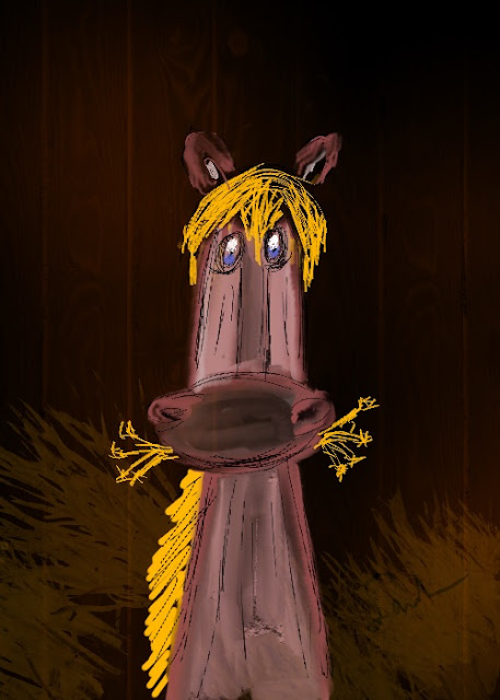
This adorable horse is from Ann, at Ann's SnapEditScrp several weeks ago she started drawing once a day in her art journal and sharing with us once a week. I became the Copy Cat, by being inspired by her drawings to create it in Procreate in my iPad.
This week, I looked at all of her drawings and loved the horse. I tried to draw it and could not. I decided to skip the copycat thing and put the ipad down...
Saturday, I sat down and tapped the iPad and suddenly I found I was inspired to once again become a copycat and said to myself, HAY, Never Say NEIGH!
 |
| Dia |
The first one I drew it and liked it, a lot. Bob says this one is his favorite and for once in our lives I agree with him.
Most of you know I like Black Backgrounds; my blogs have been Black for all the years I have blogged.
Since trying a background takes only seconds because Procreate is done on a different layer, I simply tapped the copper background and changed it to Black.
 |
| Noche |


22 comments:
He is TOO adorable and silly!!! You did so good!! I think Dia is my favorite, but the black background one does make him stand out more. So you drew this yourself on the iPad?
Hari OM
Squeeeee!!!!! Can't pick - they are a pair... matched, just like night and day!!! YAM xx
Great drawing - love both but will vote for Noche.
I love these. You did awesome. I'm having a hard time deciding which one I like both. I love the wood looking background of Dia but the horse stands out more in Noche
Not sure I could puck a favorite!
I love both yours and Ann's horse! Well done! The Dia and Noche are great! Take care, enjoy your day and the week ahead.
Hard to decide on a favorite, so cute! Ann is inspiring a lot of us with her drawings. I'm glad you are now a copy-cat as it's fun to see what you create too.
Your horse is so darn cute, bravo!
Way to go! I'm glad you didn't force anything, then waited for the urge to come back around. Both of these are cute, but I'm voting for Dia.
Now he(she?) needs a name!
I love them! Noche is my favorite.❤️
These are great and I think you have much more talent than you think. Great job. Personally, I like black backgrounds as well..
Great job! I can't pick which one I like. Those are frame worthy. For real! Personally, I like white backgrounds but I say Po-tAto PO-tato. *giggle* To each his or her own. I also wear a white riding jacket. It's more visible on the road than a black or dark one.
Have a happy holiday. Love to you both. 💙
I like Dia. I can see it better. I LOVE YOUR HORSE. It is so cute and so adorable.
Well done!! Noche is my favorite too
Hugs Cecilia
You did an excellent job of copying this one! (Love both Ann's original and your two copies.)
They are both good but I vote for Dia. I like the barn like backing.
I will Never say NAY ! Fantastic Sandra. I do actually like both of them. You captured such personality in your drawing.
Love it...
Sue
HAY, I believe the word is "neigh". LOL. But it sounds like "Nay". (HAY should also be spelled HEY, but they sound alike too, so HAY HEY, HO HO, Nay Neigh, No NO) And so Dia and Noche also sound like they look, and I love them both. They are quite a pair. Frame them with some horse's "hames" (collars) and hang them on the wall. You might even be able to make prints of them and sell them on Etsy. They are that cute. Good job. Hay Hey! Neigh Nay!
It’s hard to choose between they’re both excellent. But if I have to, I’d pick Noche only because his ears stand out more due to the background. He only beat out Dia by a head!
Wonderful horse! What fun. Here's to more fun!
it’s really hard to pick a fav. but I love yours! 💗💗💗
Too cute on both of these! You and Ann are so talented. I am the clueless techie girl. But I sure admire your talent. Plus horses are so cool.
Post a Comment